
Interiors
How to Choose Art for a Home Office, On and Off Camera
A practical three-view test for choosing one artwork that supports the room you work in, reads clearly behind you on video calls, and still feels personal when the camera is off, before you choose a size or wall.
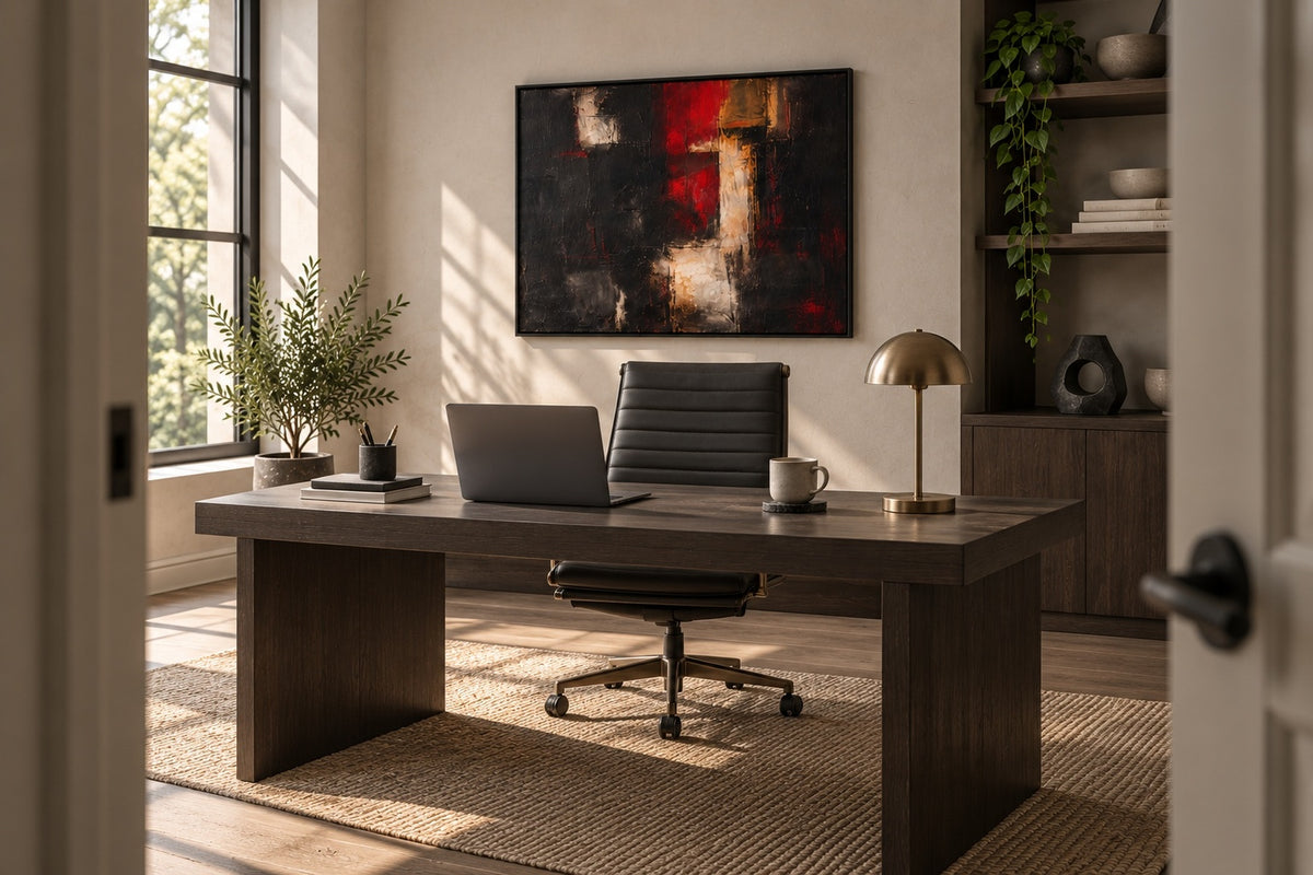
The best artwork for a home office has to succeed in three different pictures of the same room: the view from your chair, the crop seen by your camera, and the wider room you meet at the doorway. A work can feel compelling at the desk but become a distracting block on screen. It can look balanced in a video call yet feel too small when the laptop closes.
Use a three-view test before deciding. It separates taste from placement and gives you a repeatable way to judge scale, contrast, light, and material presence. The goal is not to make your office resemble a set. It is to choose art that still feels rewarding when no call is taking place.
Choose for three views, not one wall
Start by identifying the wall that the artwork will occupy, then record three standing or seated positions: your working chair, your usual camera position, and the doorway or main approach into the room. Take one photograph from each point. The images do not need to be polished. They simply stop you from evaluating the wall from only the most flattering angle.
Each view has a different job:
- The chair view should support sustained attention without demanding it every minute.
- The camera view should leave your face visually separate from the artwork and keep the main composition legible inside a tighter crop.
- The doorway view should make the office feel intentional as part of the home, not like a temporary workstation.
This approach is more useful than asking whether office art should be calming, energizing, abstract, or figurative. Those categories can help, but they do not resolve the real placement problem. One work must operate across changing distances and fields of view.
View one: judge the work from your chair
Sit where you normally work and look toward the proposed wall. If the artwork will be directly in front of you, test whether its strongest contrast sits in your central field of view or slightly to one side. A composition with one very bright or high-contrast area can become a repeated visual interruption when it occupies the same place as your screen. A work beside or behind you can tolerate more visual energy because it is encountered in pauses rather than continuously.
Do not reduce this to a rule that dark art is distracting and pale art is calm. Distribution matters more than a simple color label. Ember Threshold, for example, contains deep black fields, red passages, mineral white, and warm metallic tones. Its quieter dark areas can hold the wall together while the lighter vertical structure gives the eye a place to return. The choice is still personal, but the decision becomes specific: where will the brightest passage sit relative to your screen?
Mark the proposed width and height on the wall with paper or low-tack tape. If you are uncertain about size, the method in The Thirty-Inch Mistake helps turn an abstract measurement into a visible boundary. Work for ten minutes with the outline in place. You will learn more from that interval than from assessing an empty wall at arm's length.
View two: test the crop through your camera
Open the exact video application and device you use most often. Microsoft Teams, for example, allows you to preview your video and background before joining a meeting, as described in its official video settings guidance. Use the real preview rather than guessing from the room. Laptop cameras, external webcams, and phone cameras can frame the same wall very differently.
Check four things in the preview:
- Does the artwork appear as a recognizable composition, or only as an unexplained fragment?
- Does a strong light or dark edge seem to touch your head or shoulder?
- Does the artwork compete with your face, especially when the room is dim?
- Can the camera crop change slightly without losing the work entirely?

Leave a little visual breathing space around the work. A camera crop can make an artwork appear larger than it feels in the room, so the screen should not decide the wall size by itself. If the composition only works when your camera is perfectly fixed, the placement is fragile. Move the camera a few centimeters, sit naturally, and test again.
View three: enter the office as a room
Now leave the desk, walk out, and return through the main doorway. This is the view that reconnects the office to the rest of your home. Ask whether the artwork creates a clear destination for the eye and whether its scale relates to the desk, storage, or wall opening around it.
Doorway distance often reveals a problem that the camera hides. Small details that are attractive at the desk may disappear, leaving only the broad value pattern. That is not necessarily a failure. The question is whether the simplified version still feels coherent. The Journal essay Why Hallways Are the Honest Gallery develops the same principle: an artwork must survive movement, partial views, and changing approach distances.
Compare your doorway photograph with the chair and camera images. If the work looks undersized only from the doorway, a larger format may solve the room view while overwhelming the camera crop. Before changing size, consider a different wall, a wider camera angle, or more empty space around the work. The three-view test is useful precisely because it reveals these tradeoffs before the purchase.
Light and surface still matter
A home office changes through the day. Window light may strike the artwork in the morning, while a desk lamp or ceiling light takes over after dark. The Smithsonian Museum Conservation Institute's guidance on caring for paintings recommends hanging a painting away from direct sunlight and heat sources. Separate that care check from your viewing test: inspect the wall from all three positions in daylight and under the lighting you use for calls.
Look for direct sun on the proposed wall, bright reflected patches, and a lamp that produces a persistent hotspot. These observations do not require specialized equipment. They tell you whether the placement allows the artwork to remain readable and whether lighting advice may be needed for long-term care.

Texture introduces another variable. Raised passages and changing sheen can make a work feel active as you move through the room, even when the camera records a flatter image. This difference is part of the work's material presence, not a defect in the screen view. The related essay on what photographs cannot show about a painting explains which image roles help you assess texture, angle, and room context online.
Run the ten-minute test before you commit
Finish with a simple rehearsal. Mark the artwork's dimensions on the wall. Place your chair and camera as they will be used. Check the three views in daylight, then repeat under evening light if that is when you usually work.
- From the chair, note where your eye lands when you look away from the screen.
- In the camera preview, check separation, crop, and background contrast.
- From the doorway, judge the relationship between artwork, furniture, and open wall.
- Change only one variable at a time: position, size, camera angle, or lighting.
If one option remains strong in all three views, you have a defensible room-fit decision. If every option fails in a different view, the wall may be the wrong location. That conclusion is useful. It prevents you from asking a painting to solve a layout problem.
To compare works with the test in mind, explore ARTMERE's abstract art collection. Keep your three photographs beside the product images and use the listed dimensions as the factual reference. The right choice should hold the room together on screen, off screen, and on the walk back in.
Share this story
Continue reading

