
Interiors
Why texture outlasts every color decision
When collecting begins, color decides. What stays with you after a year, after three, is something harder to quantify: the physical surface of the work, the way a ridge catches morning light differently than afternoon light, the depth a brush pulled through wet paint. This is what separates a painting from a print, and what makes certain pieces impossible to walk past without stopping.
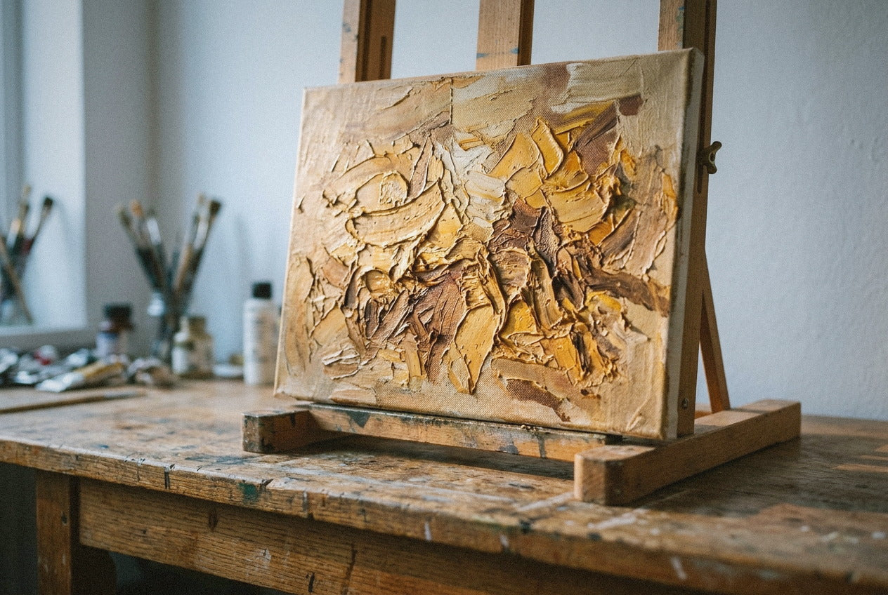
The west window in the atelier has a particular quality in June: the light comes low and sideways, and it shows you everything. I stood last week in front of two canvases mixed from the same palette, nearly identical in photographs. One caught a ridge of cadmium and threw a shadow two inches long across the surface; the other left the atelier that afternoon.
What You Buy For Versus What You Keep
Seven out of ten first-time collectors describe a painting by its dominant color when they write. That makes sense. Color is what registers from across a room, what resolves in a thumbnail, what you can describe to a friend without needing to explain anything further. It is the most immediate language a painting speaks, and I rely on it myself when a composition is not working.
But by the time a collector contacts me about a second piece, four of those seven ask specifically for more surface. Not a different palette. Not more contrast. More surface. They have lived with the first painting long enough to understand what actually keeps them stopping in front of it every morning, and it is not the color they named when they ordered.
Color introduces a painting. Texture is what it says once you live with it.
This shows up most clearly in how people talk about works they regret. The painting they returned was almost always described as flat. Not ugly, not wrong for the room, not the wrong size. Flat. As in: once it was on the wall, there was nothing left to find in it. The color had read exactly as promised, and that was all there was.
What Summer Light Reveals
June and July are when this distinction becomes most literal. Summer light rakes across surfaces at a lower angle in the morning and evening, and impasto passages, where the knife left thick ridges of earth pigment or cadmium, respond differently than flat areas. A section that reads as neutral in a photograph will catch that raking light and hold it for thirty minutes before the angle shifts. The same painting reads warmer in summer, not because the color changed, but because the surface is three-dimensional in a way no screen can replicate.
If you are considering two works right now, look at photographs taken at different times of day. The painting that changes more between images is the one with more surface. That change is not a flaw in the photography. It is the work behaving as it will in your home, every day, for years.
I pressed three fingers across every surface in the current collection before anything shipped. That test has become a threshold: a painting that reads flat under that pressure goes back for another pass. Not because the color is wrong, but because the piece has not yet earned its own shadow.

What a Print Cannot Do
There is a simple way to put this. A print is a record of a surface. A painting is the surface. A high-quality reproduction of a heavily textured work will transfer every color decision accurately and miss entirely the quality that makes the work worth returning to. Among the works in the textured collection, every surface reading I have described above exists physically in the pigment, built over multiple passes with a palette knife and allowed to dry between each layer. That is not something that can be scanned, printed, or exported.
The question collectors sometimes ask at this stage: does this matter if the piece is going in a hallway or a study, somewhere I pass but do not sit with? It does. Perhaps especially there. A flat work in a hallway stays at the same visual temperature every time you pass it. A textured work with that same palette will read differently depending on whether you pass at seven in the morning or at eleven at night. That is not inconsistency. That is depth.
Color gets a painting noticed across the room. Texture is what makes you stop in front of it ten years later.
How to Read a Surface Before You Commit
Three things I look at when evaluating whether a surface is genuinely built or merely described in the listing copy.
First, how does the artist talk about material decisions? An artist working with physical intention uses material language, not just palette language. What temperature was the pigment? How many passes did a section take? Was the knife dragged or pressed? Color comes up, but it is not the only vocabulary.
Second, zoom to 200 percent on the highest-resolution image available. On a flat work, zooming in shows brushstrokes dissolving toward the edge of visibility. On a genuinely built surface, you start to see the architecture of the paint: ridges with their own micro-shadows, even in a flat overhead photograph.
Third, look at where the light source is in the product photograph. If every photograph was taken from directly in front with even light, the surface cannot be evaluated from the image alone. That evenness is either an accident of the photography or a choice to conceal.
I wrote about the longer relationship between a collector and a work in a piece on the painting you keep discovering, the way certain pieces surface details over weeks rather than revealing themselves all at once. Surface is part of that patience. And the hour before varnish covers the last decision made before a painting ships, which is often a surface decision, not a color one.
What you cannot see in a photograph is the reason you will not stop seeing it once it is on your wall.
Share this story
Continue reading

