
Process
What the photo never captures
Every photograph of an original oil painting is a small lie. Not from dishonesty but from physics. A camera sensor reads reflected light from a flat plane. An impasto surface with relief and variable texture reflects light at dozens of angles simultaneously. This note is about the gap between the screen and the wall, and why that gap works in your favor.
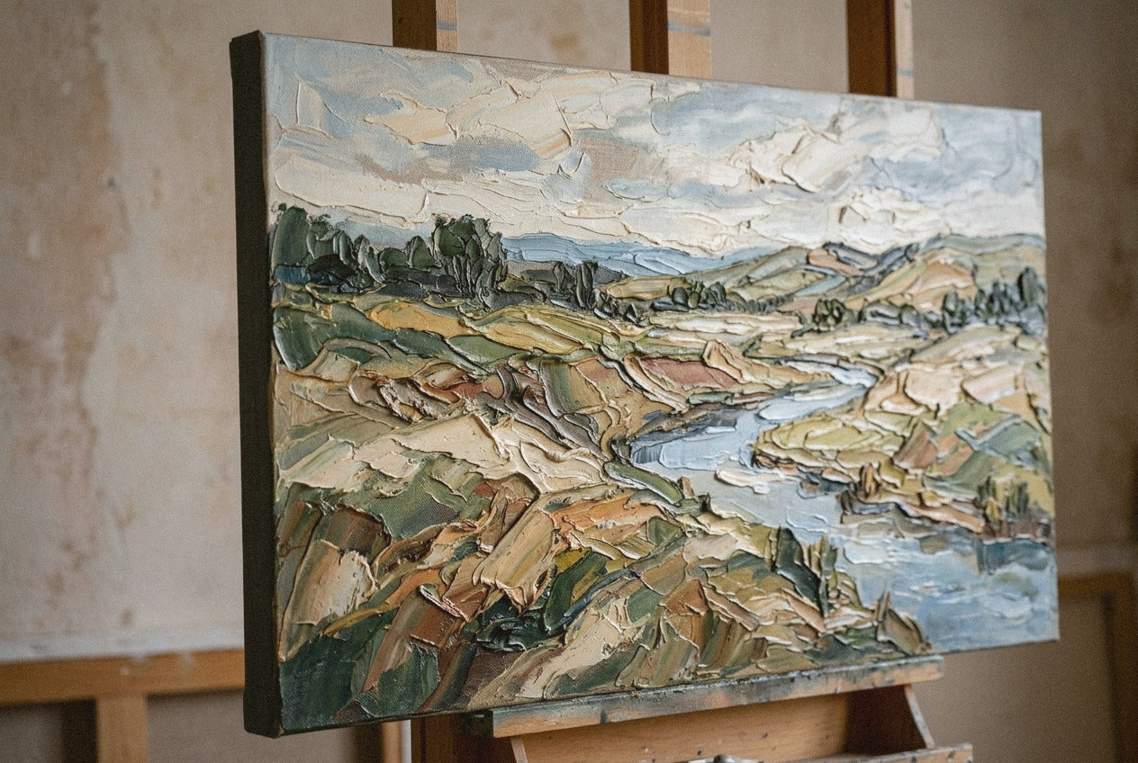
It was a Monday in the Brooklyn atelier, mid-morning, the light from the east window already starting to flatten against the south wall, and I was holding a freshly photographed canvas next to a screen showing the photograph I had just taken. Same piece. Same afternoon. The painting had weight and presence. The screen had a flat rectangle with an interesting color story and very little else.
What the camera is actually measuring
A photograph does one thing well: it reads the average reflectance value of each point on a surface. For a print, a watercolor, a pastel, that is more or less the whole story. The surface is flat. Light hits it evenly. The sensor catches it accurately.
An impasto oil painting is not a flat surface. It is a landscape at a scale of millimeters. A brushstroke pushed across a primed canvas with a palette knife creates ridges, valleys, and undercut edges that redirect light in every direction. Under natural morning light from the left, a ridge catches warm direct light on its upper face and throws a cool shadow on the right side. Every pass in front of it changes the painting you are seeing.
The camera takes one picture. It collapses all of that into a single reading. The result is a painting that looks, under most studio lighting setups, flatter, quieter, and slightly less saturated than the original. Not because the photograph is poor quality. Because the photograph is doing what photographs do.
What collectors say when the canvas arrives
There is a pattern I have noticed, consistent enough to be useful. When a painting ships and the collector sees it for the first time, the first comment is almost always about scale. It is bigger than I thought. The second is about texture. I could not tell from the photo. These two surprises arrive together nearly every time, and they are related.
Scale and texture both compress online. A large canvas with heavy impasto surface reads on a screen at roughly the same visual weight as a smaller canvas with thinner paint. The eye has no reference point. The hand, standing six inches from a freshly hung canvas with two millimeters of relief across its surface, has every reference point it needs.
This is not a complaint about photography. It is an observation about what photography selects for. A flat print, a limited-edition reproduction, a giclee made to look like a painting: those photograph accurately, because they are flat. An original oil painting photographs as a compressed version of itself. The information lost in compression is the information the hand put there.
The camera takes one picture. The painting takes every light source in the room and does something different with all of them at once.
Reading a product photo with different eyes
Once you understand the compression problem, the way to read photographs of original paintings changes. You stop looking for what the photo shows and start looking for what it suggests. If the colors feel muted, the original is usually richer. If the surface reads as textured even under studio lighting, the relief in person is almost certainly more pronounced. If the painting seems to shift slightly depending on which corner of the image you look at, that is the light catching different facets in a single exposure.
There is also a negative test. If an oil painting photograph looks exactly like a print, with perfectly even texture across the whole surface, the paint is probably thin. That is not a flaw in itself. But it means the photograph is giving you an accurate read, and what you see on screen is what you will get on the wall. The gap I am describing only exists when the surface has something for light to work with.
I wrote about this texture principle from a different angle in a note on why texture outlasts color, and the same logic applies here. The color story in a photograph is close to accurate. The texture story is significantly compressed. Which means: if you are choosing between two pieces online and one has a more interesting texture story even in photographs, the gap in person is likely to be even more pronounced in that piece's favor.
What the screen cannot decide
There is a version of uncertainty people feel when looking at original art online that they mistake for hesitation about the work. It is not hesitation. It is the correct instinct that something is missing from the image. Every photograph of an oil painting is a starting point, not a final argument.
The atelier photographs I spend the most time on are always the paintings with the most physical presence. The thickest passages, the most directional brushwork, the clearest evidence that a hand made a series of specific decisions under specific light. These paintings are precisely the ones that photograph as flat. And they are made one at a time because that kind of surface cannot be maintained across a batch.
The next time you look at a photograph of one of these paintings and think you are not sure, that feeling is not a problem with the painting. It is the gap the canvas was made to survive.
Share this story
Continue reading

